Course Diagram's (ideas, thoughts?)
Moderator: Pat Chewning
-
Jani Soderhall
- Former ISSA President (2011-2024)
- Posts: 4811
- Joined: Thu Aug 22, 2002 2:00 am
- Location: Sweden, lives in France
- Contact:
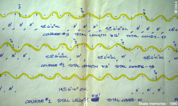
I don't remember who sent me this one back in the 80's or early 90's, but I was impressed back then, because we never tried to record our courses. Actully we took great pride in never doing the same thing twice. The drawback of that was the results from different competitions (or year after year) could never be compared.


-
Robert Sydia
- Robert Sydia
- Posts: 179
- Joined: Fri Nov 22, 2002 1:00 am
- Location: Toronto, Canada
Being a relative newbie and based in Canada - I would be really interested in receiving any course diagrams/layouts.
I am impressed with the Excel diagram, but would even accept hand-written course diagrams. Could be as simple as simple diagrams with cone spacing indicated.
I would also be interested in seeing examples of different cone set-ups (stingers, gilmorian curves, vlad cones, etc.) Once I have seen how they are laid out, then we could incorporate them into training courses.
Maybe a forum where people post diagrams/measurements of their favorite courses would be useful and others could use them.
Just a suggestion.
Rob
-
Etienne de Bary
- Etienne

- Posts: 400
- Joined: Wed Oct 30, 2002 1:00 am
- Contact:
that use of Xcell is very smart, but still it's strange to use that format.
it makes a very complete document, but not very visual though. Not WYSIWYG.
Seems more natural to work with a vector drawing tool (ideally ArchiCAD or such technical soft, but lots of sharewares would do, or bitmap drawing tool like photoshop would work fine too) and then export into Jpg image showing cones & structure lines, some quotes... (or whatever standard image format.).
A map is what one expects, i guess.
-
Jani Soderhall
- Former ISSA President (2011-2024)
- Posts: 4811
- Joined: Thu Aug 22, 2002 2:00 am
- Location: Sweden, lives in France
- Contact:
The ISSA used to have it as standard practice to pass the first cone on the right. As all skaters don't practice the same way we often drew an arrow on the street to indicate the way to enter the first cone.
I used to be very serious about this topic, now I don't think it matters that much any more. It is more important if you push start until the first cone, in which case you have very little time to get your foot up and in the right position before the first cone.
However it would be good to get all skaters used to the same system... If at all possible. That was part of the ISSA idea: To let slalomers know what to expect when they arrive at a race, even in a foreign country they have never visited before.
-
Adam Trahan
- Phoenix, AZ, USA
- Posts: 795
- Joined: Tue Apr 02, 2002 2:00 am
Glenn, nice job!
I'm with Hans, it doesn't mean it's right, but from the bottom to the top, it's a bit easier to digest for me.
EXCEL is a good format as well. Although I am EXCEL challenged, many aren't. This is a good program that can do way more than plot a course and I would hope that more course setters would use this format.
On any account, your diagram is good.
adam
P.S. Is it standard fare to pass the initial cone on the left? I set my courses passing the first cone on the right... Then again, I am a right foot forward (goofy, kook, etc) skater.
Hans,
That program is fine but not everyone has Excel which is part of an expensive MS Office program, and many people don't use Windows either for that matter. I still think that having a diagram like the one I posted is the best for a quick "Visual" reference for course ideas. Anyone else think so?
And actually I messed with that Excel program a bit. This is faster I think, it was really easy and quick doing this with MS Paint.
And I don't think that you need exact. It is just the ideas of different course elements and suggested cone spacing that I'd like to see.
Sort of an online course in course making.
Glenn
PS. Hans, I do have Excel. If you've made up any courses using that program I'd like to see them. Can you post them here or email them to me? Do you have good course making skills?
=======================================
UPDATE: I found out that most modern web browsers can view Excel files. Or if for some reason you can't go <a href=http://office.microsoft.com/Assistance/ ... rscvt.aspx> here</a> to get a free viewer from Microsoft.
<font size=-1>[ This Message was edited by: glenn on 2003-02-16 00:00 ]</font>
-
Hans Koraeus
- Corky - World Ranking Supervisor
- Posts: 2075
- Joined: Fri Aug 23, 2002 2:00 am
- Location: Stockholm, Sweden
- Contact:
Glenn,
I found the link I was talking about in the topic "Course setting equipment and canned courses".
http://www.roeslalom.com/SampleTight.xls
I think this is the way to go. Forget about MS Paint. That's to much work and will never be exact enough. In the same forum topic above there is also a very nice device for measuring and setting up courses.
Hans,Hans Koraeus wrote:I really like the idea of documenting slalom courses. Anyway, I would prefer to see printouts of courses going from the bottom of the page and up. That gives you a better feel running it thru in your head on the screen.
I think that is a good idea to start from the bottom and go up. I could have also written on the diagram start and finish. I did that very quickly and could easily add more detail.
I think that diagrams like this can only accelerate the learning curve of course design. I hope that eventually we have a few of these here to look at.
I don't have course design knowledge, so it won't be me that can provide them. I need someone with the knowledge to fax me the drawing of the course. I can do the PC drawing if you like
Glenn
-
Hans Koraeus
- Corky - World Ranking Supervisor
- Posts: 2075
- Joined: Fri Aug 23, 2002 2:00 am
- Location: Stockholm, Sweden
- Contact:
I really like the idea of documenting slalom courses. Wasn't there a link somewhere in a forum topic to a program doing this?
Anyway, I would prefer to see printouts of courses going from the bottom of the page and up. That gives you a better feel running it thru in your head on the screen.
It could of course be solved by buying one o these lightweight flat screens so you easily can turn the screen upside down. Or if your name is Dan and like constructing trucks you could always do a handstand on your table in front of your screen. Oh, did I forget to tell you that this last paragraph is only for non serious members of the forum.
<font size=-1>[ This Message was edited by: Hans Koraeus on 2002-11-11 11:13 ]</font>
-
Etienne de Bary
- Etienne

- Posts: 400
- Joined: Wed Oct 30, 2002 1:00 am
- Contact:
I thought I put this up here and see what ideas come from it. As a relative newbie to skating around cones, I like the idea of having a few Course Diagrams for someone that is just getting into the sport to see "Visually" what can be done with a course. And to show that slalom courses are Not just a straight line of cones. This would have been great when I first started skating cones not long ago, not having anyone else to show me.
I think a main focus of this site should be to give anyone new to the sport ideas and information. I'd like to see some of you more experienced slalomers help to post some diagrams like the one below. So beginners could be directed to them to get them started with ideas.
But I also think that after you understand the different elements that can be put into a course, that you'll just "pace" down the course and "plop" the cones where you see fit with no measuring tape, etc. And make great courses. That diagrams like this would just be a starting point to visually see what a slalom could be.
But here is a Course Diagram that I fairly quickly did up in MS Paint. It came from a course that John Gilmore wrote for a friend of mine when they were up in Morro/Avila this past World Contest. I could make the font better and maybe add some color, but this was quick.
Also, I think that any course diagram posted here should Not be too easy. That it just be a typical to expert course. If you want easy just increase the spacing between cones if you cannot make it. Or explain how to make it easier.
If you post a Course Diagram yourself please start another topic. That any Course Diagram posted here should be posted as its own topic. This is just a test, and I'm not sure If it can be hosted on my limited webspace for long. But tell us what you think of this course, or the idea of having some more diagrams like this avialiable on the site here:
================================
<b> UPDATE</b>
I lost that original picture diagram that I did which was on my server that crashed. So I'll post these pictures for now that are Vlad's from his practice sessions during the Paris 2003 contest:
<img src=http://www.slalomskateboarder.com/event ... ctice1.jpg>
<img src=http://www.slalomskateboarder.com/event ... ctice2.jpg>
<img src=http://www.slalomskateboarder.com/event ... ctice3.jpg>
<img src=http://www.slalomskateboarder.com/event ... course.jpg>
<font size=-1>[ This Message was edited by: glenn on 2003-10-10 12:59 ]</font>


